When I was asked if I was “plurking yet”, I thought it had something to do with baby vomit. But no, it is once again another Web 2.0 name and once again another lifestreaming service that tries to imitate Twitter, while at the same time it tries to show people how different it is from Twitter. Confused? Don’t worry, you won’t be in a moment.

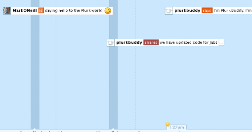
In a nutshell, Plurk is basically the same as Twitter but with a “timeline” thrown in. Exclusively confined to the website at the moment (there aren’t any Plurk desktop apps right now – yet), you are able to say to the world what you are doing, how you are feeling, what you want, and much more. You can even share weblinks such as YouTube videos – which are playable inside the timeline. These messages are called….you guessed it…..”plurks”.
I’ve spent a couple of days playing with Plurk and trying out the different features. At first I detested the whole thing. My first reaction was “Oh God! I hate this!” and to a certain extent, I still feel a certain negativity towards the whole thing. I guess I will never really warm to it that much, the same way I have warmed towards Twitter. But I kind of like it a lot more today than I did a couple of days ago.
So let’s start plurking!
When you are in Plurk for the first time, it will be just like Twitter – it will be quiet because you won’t know anyone (except for “PlurkBuddy” who is there to dispense some friendly advice to you). So you can click on “Interesting Plurkers” in the top right hand corner of the screen and start following some of them to get the action going on the screen.
 One of the problems about Twitter is that the more people you have following you, the more unwieldy they become to manage. Plurk on the other hand allows you separate your friends into groups or “cliques” and you can send plurks to a particular clique.
So you can have a work clique, a friends clique and so on. This makes managing your friends much more easier and is one of the Plurk features that I really like.
OK, so now you have some “friends” on the screen sending “plurks” your way. Now it’s time to reciprocate and send a plurk back. So just off the top of my head, I wrote :

Once you hit “enter”, off it goes into your timeline for your friends to read and respond to if they want to. But you don’t only have the choice of “thinks”. If you hit that downwards arrow, you can also choose from verbs such as “likes”, “hates”, “is”, “shares”, “feels”, “says” and many more.
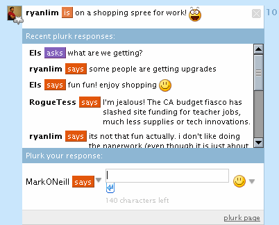
Now if you’re a Plurk friend of mine and you saw that message, thought it was the most profound thing you had ever read, and felt you just had to respond, then you just have to simply click on the message in the timeline. That opens up a reply box in which you can type a reply.
When a reply is sent, I will then see this next to your Plurk in the timeline screen :
 The number in the coloured box alerts you that there are replies to your message. To read them, just click on the number and the message box expands to reveal the replies. At the bottom of the message box, you can leave your own replies to the replies, as you can see below :

Now when one of your Plurk friends leaves a new message, you will be notified by a message in the corner of your screen :
 This can actually lead to one big load of stress! When you are clicking on this link, the timeline moves back and forth to where these new messages are and if you are following a lot of people, this can prove to be a bit on the stressful side, trying to keep up. I really hope Plurk finds a better way for users to receive new updates because I personally don’t like this method.
How about a RSS feed or a nice smooth drop-down list instead? Why does it have to be a back and forth scrolling timeline?
The part though where I think Plurk really kicks Twitter’s butt though is the ability to share YouTube videos and photos. As yet, you can’t do this in Twitter but you can in Plurk, simply by using the “shares” prefix and then posting the link in the box :

When you then send the Plurk to the timeline, a thumbnail appears in your Plurk and when someone clicks on it, a larger box opens up inside the timeline to reveal the photo / video. If it’s a video, it will automatically start playing. Why can’t Twitter do something like this?
One of the weird things I found about Plurk was the “Karma Points” system. You couldn’t unlock certain features until you had done certain things. So you couldn’t alter certain parts of your profile until you had accumulated some karma points or you had invited some friends to join or so on. Very weird.
You can also apparently Plurk from your instant messaging program (all major platforms supported) and there is supposed to be mobile phone support but I searched high and low to find the page for this to no avail. If anyone can point out the Plurk mobile phone set up page, please do because so far it is eluding me.
So in conclusion, Plurk is a good application with good potential which many social media junkies will enjoy. But I just haven’t been able to bond with it, the same way that I have with Twitter. But hey, each to their own. I’m not saying Plurk is bad, I’m just saying it isn’t for me. But it’ll be interesting to see where this goes in the future and if it has the staying power to compete with Twitter.
I happen to like Plurk, I just hope it turns out to be more stable than Twitter.
You can get update via SMS by going to Ping.fm and registering with the beta code “landofping.” The mobile version of Plurk can be found at https://www.plurk.com/m/
Sams last blog post..Brightkite Adds Commenting
Sorry for the double comment but, I agree with you on nested comments. I think it cleans up a ton of noise. On Twitter there are a ton of replies and you get lost in the sauce.
The devs of Plurk seemed to take good clues from both Pownce and Twitter. Now I would be blown away if you could share 10mb files on Plurk like you can on Pownce. That would make me 100% Plurk loyal.
I really like the way plurk looks, although i just got my family on twitter about 2 weeks ago. so i’ll let ya’ll test it out and see if it’s all that and a bag of chips before I make the switch.
I’m not a hardcore twitterer, but the downtime has annoyed me so I can’ imagine you people that rely on crap like this to get the words out must feel.
bye
thatjonjackson
that jon jacksons last blog post..1
i’m not 100% convinced.
sir jorges last blog post..Hard Eight Dvd Review
Two thumbs down. It’s bloated, clunky, overfeatured, and what’s up with needing “karma” to edit my profile???
The reason I love Twitter is simple… Twitterberry. How the hell is Plurk going to be simplified down to a tool that can be so readily accessible and as easy to navigate on mobile devices?
Eric Odoms last blog post..Blog SEO Tips – WordPress SEO
It’s about two days i’m testing it and it seems more spicy than twitter, it looks like a theme free irc channel chat.
btw i’ve also tested a little the api information that i was able to find, and it seems to be very easy to use, custom widget, email to plurk, sms to plurk are things that a php coder can code in less than a day (i say this because ‘ve just finished to these things).
I still think that the key factor of this new microblogging system, or better it could be consider like a little viral IM, is the karma scoring system that will allow you to increase your features only if you are a partecipative member.
Other key points? Mhhh at this very moment it isn’t crashed yet…
gh3s last blog post..Plurk via email e via sms
Nice write up – not sure what to think of Plurk yet. It certainly is more stable, but finding it hard to deal with following comments. The roll-over/click/scroll method to find all the bloody things is a PITA.
I have fell for Plurk big time. At first glance, I was happy to hate it… But after digging deeper I found a great platform to lifestream with.
I also like that its built on Python, one of my favorite languages.
ThinkingSeriouss last blog post..Plurk Unleashed!
I’m liking the look of it, seems they weren’t prepared for the traffic via TechnCrunch, and had some scrambling to do to fix it. About time those with traffic approached their blog posting with more social responsibility, and send a wee warning email to the developers.
Anyway, thats neither here nor there, it seems a good bit more organised than twitter, and more userfriendly interface wise. Definitely going to give it a bash.
Mark – hope we see this piece making the rounds. It’s a good overview and tutorial. Originally, I thought I was gonna Plurk … but then found it not only useful but fun.
I was a little late to the Twitter bandwagon, now I’ve got to check out Plurk! Thanks for the reminder.
Plurk is really awesome!Though plurk is better when compared to twitter, the latter is still my favorite. Don’t know why!
That’s quite a tutorial on Plurk. I have been there a few times. But you know, time to do everything is limited. I do like it. But I think I like Twitter better out of simplicity and no need for a UI.
Stephan Millers last blog post..Getting Closer to the Clouds
thanks nice tips. but this plugin will not make our site load harder, right?
locjans last blog post..1
Don’t get me wrong. I like Plurk. I like the concept behind Plurk. But I don’t have time for it.
Of course, this is how I felt about Twitter at first, then I discovered if you changed the settings you can get constant Twitter updates via IM. Then I fell in love with Twitter and use it daily.
Maybe one day I’ll change my mind about Plurk… but, right now, I just don’t see myself spending that much time on there.
Plurk looks very cool, wish I had an extra hour a day to spend with it!