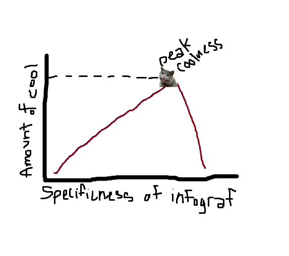
Through my extensive and rigorous work creating and promoting infographics, I began to notice a correlation between the type of information that make up a good infographic. The subject, however, is not what makes a good infographic. People are just as likely to click on one about medical practices in the 20th century as they are to click on one about how scoring works in sports. No, the subject matter is not what makes an infographic popular, it is, in fact, the specificity of the subject matter. Take a look at this graph below and I will elaborate.
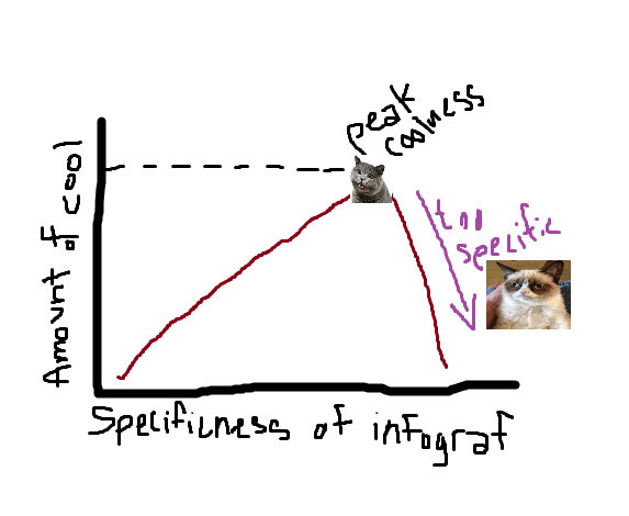
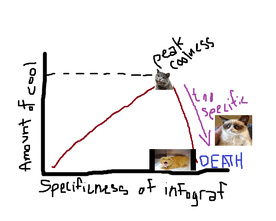
As you can see, the more specific an infographic gets, the cooler it becomes. However, there comes a certain point, we call that “Peak Coolness” that the infographic subject matter can no longer be improved, and any attempt to improve it will result in disaster. The key is to know when you’ve gone too far.
Here’s an example of a great infographic idea-
1. Medical practices: Good
2. Medical practices in the 20th century: Better
3. Medical practices in the 20th century that are no longer used: Great
4. Medical practices in the 20th century that are no longer used because they were dangerous and didn’t work: Perfect; this is the infographic you make.
BUT, if you go any father, the whole thing falls apart. For example:
5. Medical practices in the 20th century that are not longer used because they were dangerous and didn’t work ON DOLPHINS
6. Medical practices in the 20th century that are not longer used because they were dangerous and didn’t work ON DOLPHINS IN MARYLAND
These last two aren’t going to happen so stop trying to make them happen.
Peak Coolness exists when the right amount of “specificness” exists. Too vague, and you risk creating a boring infographic of information that everyone already knows or providing incorrect or irrelevant information. But, if it’s too specific you risk looking like a fool (see 6. above).
An indication that something is too specific would be that there simply isn’t that information available. There is likely a good reason that this information doesn’t exist, i.e. no one cares.
The more specific you get, the farther away from your goal you get and the smaller your window of reach an promotion become. Appealing to a wide variety of Internet mediums and mommyblogs are great ways to spread the infographic, and getting them out to as many as possible is the essential first step of a successfully promoted infographic.
Too much specificity results in a dead, useless “infoposter” put together with the blood, sweat, and tears of countless wasted hours of meaningless and endless research. There is a fine line, but hopefully now you’ll know when line begins to curve.
![Amount of Cool [graph]](https://nowsourcing.com/wp-content/uploads/2012/11/linegrapf.png)


