This week has seen Facebook and Google Plus introduce new designs to its users, each site trying to outdo the other in terms of visual appeal. And Google reinforced its Google Plus design changes with a new look to YouTube’s user pages as well. But will these changes persuade more people to use the sites, at the same time when 60% of Facebook users are starting to walk away from the site, due to boredom, and when more teenagers are using Twitter than Facebook?
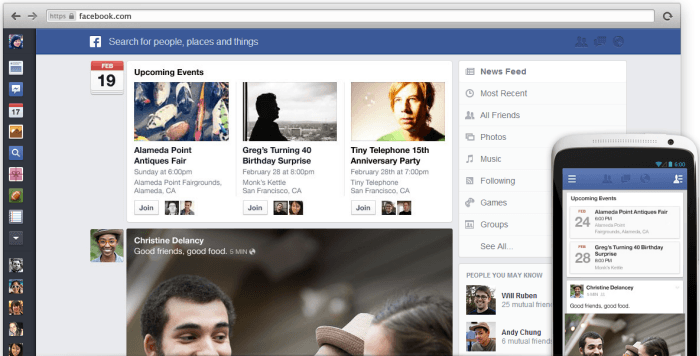
This week, Facebook announced that the News Feed page (the page you see when you log in, where your friend’s status updates are) will be completely redesigned. New filters will be introduced which will enable you to see only what you want to see and “clutter” has also been removed, giving the page an overall fresher, more appealing look.
Here is Facebook’s video, briefly discussing what you can expect :
[youtube https://www.youtube.com/watch?v=_PW54Sm99ck]
I haven’t personally received the new design yet. It is being slowly rolled out to users, but if you want to jump ahead in the queue, you can go to this page, scroll down to the bottom, agree to hand over your soul and your future unborn children to Mark Zuckerberg, and finally click the button under “Give It A Try!“. You won’t get the new design immediately but you’ll be informed that you are on the list.

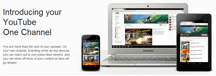
Now let’s compare that to what Google has been offering. As I said, they have updated both YouTube and Google Plus (however, the new YouTube design is currently only available if you choose it (scroll to the bottom and hit the button) – everyone else will get it when Google is ready to roll it out). The new YouTube design is called “One Channel” and it enables you to “reach out to non-subscribers”. You can do this by making a promotional trailer (similar to the movies) in which you introduce yourself. You can then have it in a prominent place on your new user page.
[youtube https://www.youtube.com/watch?v=bRJEmA6P1SQ]
You can also have a nice looking header at the top of your user page – does this start to remind you of your Facebook wall?
I will be doing my trailer probably sometime this week (I need to have a shave first and clean up my pigsty of an office!) but here is my header image on my YouTube user page – the Alte Brücke in Würzburg where I live :

Now let’s finally jump on to Google Plus – and this is where I think Google has screwed up a bit. They are loudly trumpeting the fact that you can have BIGGER cover images (bigger than Facebook – dig! dig!) but I think the Google Plus guys who were deciding how big to make the images must have had a bit too much to drink. Because if you look at my Google Plus page, would you say this was a reasonable size? I have a large widescreen monitor and the image is taking up most of the screen, with my status updates virtually invisible.
Google, let me bring you into a little secret that you might find useful for future reference – size isn’t everything, it’s what you do with it that counts.
If I had to compare the three new designs that have come out, I would have to say that I am excited the most about the YouTube page. Facebook changes its design around every other week and I have already outlined why Google Plus might be lagging behind Facebook and its other rivals. So slapping a huge cover photo on the Google Plus profile page suddenly isn’t going to make people think “wow! let’s go back there!”. If anything, a huge photo like that is a huge turn-off.
But YouTube? I love the idea of the promotional trailer and I like the new design of the page. It suddenly makes me want to go back and start making videos. And if the design makes me feel that way (and hopefully others), then YouTube has already succeeded. As for the new Facebook and Google Plus designs…..to quote Bart and Lisa Simpson, “meh“.
I don’t know anyone who likes this new Google ‘One Channel’ except you. How is a glaring empty white space more attractive than beautiful background colour? this ridiculous banner must be at least 2120 x 1192 pixels so I resize it to make it fit, but then they want to use only a tiny slice out of it for your banner. but then every time I select a picture, resize it, adjust the tiny rectangle where I want the slice to come from… It then rejects the picture because the file is too large, and needs to be less than 2megabites. I’m sure this is somehow supposed to make sense to computer nerds, and Google, but I find this whole design impossible to work with, and just really F’UGLY!!!