It’s been estimated that over 60% of the population are visual learners and rely heavily on data representations in order to retain information. Though the human experience is a cumulative of all five of our senses giving us an accurate account of the world around us, we rely most heavily on our vision. The brain processes images as a whole, taking in massive amounts of real life “snapshots” all at once to paint a picture of what we see. Reading, on the other hand, works as a linear process going one word at a time. Unfortunately, information gathered through reading isn’t always retained as well as if it were from a visual source. Infographics takes valuable information and condenses it into an easier to swallow design that is not only nice to look at, but gets the information across as effectively and efficiently.
An infographic we see every day.
They say a picture is worth a thousand words, and in this generation of business nothing could be closer to the truth. The shift in what users want to see has taken an artistic turn, thanks to websites like Instagram and Pinterest that are based in visuals, rather than text status updates. Image based social networking has given us our humanity back, and classic marketing tactics now seem tasteless and impersonal to consumers. Authenticity and personality in business really pulls at the consumer’s heart strings. A company doesn’t have to just be a corporate entity anymore, let your customers see it as it is: a regular group of people with compassion, humor, and creativity.
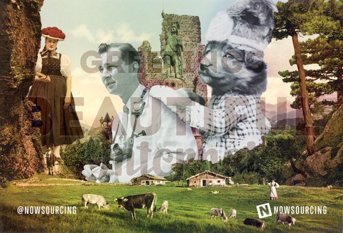
This picture is worth at least 1,000 words.
The infographic is the perfect platform to showcase your company’s best qualities, without seeming too spammy or advertisement-driven. They are a great way to tell customers your story, display your personality and unique designs, and to give them the content they want to see. Comment sections from popular infographics can run into hundreds of thousands of people joining in on a discussion and shares can reach into the millions. Infographics come together with a combination of content, design, and angle to effectively display subject matter.
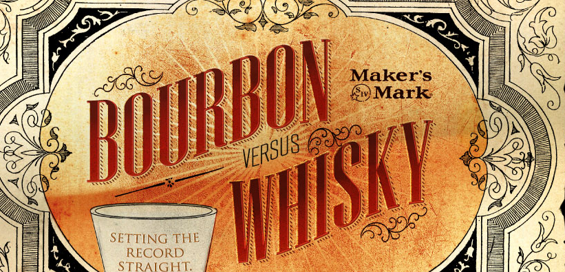
Creative design to draw attention.
Bourbon versus Whisky; Setting the Record Straight
Good design isn’t all heavy splashes and colors and gradients. Good design works in tandem with the subject matter to match the mood the information is trying to display. Graphic design is valued more than it ever has been as a true art form, now that everyone can see that it creates visuals that a pencil and paper simply cannot. Painting a picture and telling a story with pixels is perhaps the most important art form of the 21st century.
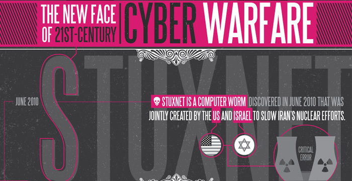
Interesting subject matter to keep readers around.
The New Face of 21st Century Cyber Warfare
Identifying what viewers might see as “interesting” is highly objective and there are different definitions across the board. The key isn’t to find what’s interesting, it’s to identify the demographic that would find the subject matter interesting. During the process of infographic creation, identify your own angle and reach out to those who are of like mind. Be careful not to fall into an echo chamber though; to get your piece circulating, outreach is essential.
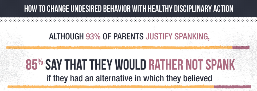
A call to action that will let readers form their own opinions.
The Science of Corporal Punishment
Controversial topics have always been hot, and in infographic form, controversy is pure click-bait. The subtle art of displaying sensitive information without letting personal opinions seep through is tricky to perfect. Put in the information you wish to present, but leave a thought provoking call to action that asks the reader what they think.
Embracing the Digital Renaissance
A photograph
By no means are infographics meant to be a main source of in-depth information on any given topic. They support a point of view that sees the value in a simple introduction or summary. Enough to grab the reader’s attention and get them interested, but not too much that they feel like experts in the 3 minutes it took them to read through it. Infographics are generally short and sweet and should remain that way.
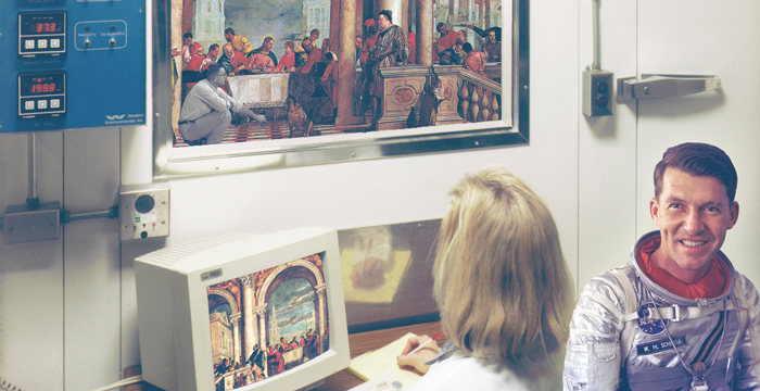
For centuries, humans have been having emotional reactions to art, and infographics are the digital renaissance.

