Every once in a while, someone somewhere declares that infographics are dead. The reasons they give often have a lot to do with things that make infographics bad, such as DIY infographics. When done properly, infographics are a valuable storytelling tool.
Infographics Aren’t Bad, Bad Infographics Are Bad
In an article from FastCo Design a couple of weeks ago, Mark Wilson declared that infographics are dead. His main points were that everyone is doing them, anyone can make an infographic thanks to new tools and software, and people are accessing the web via mobile so infographics aren’t readable for half of internet users. He goes on to say that insight should replace infographics.
All of these points have more to do with DIY infographics made by people who aren’t in the infographics business. This is why we caution people against trying to build their own infographics. If you don’t understand all the pieces that fit into the infographic design process you will end up with a picture full of pointless uninteresting nonsense, just like everyone else. If you want to stand apart from the competition, you hire an infographic design agency that understands the importance putting the right information with the right design and getting it into the right hands.
Another article posted last week on Medium simply states “infographics are bad.” Writer Michael Kazarnowicz asserts infographics are bad because they are often taken at face value and are very difficult to fact check. Again, this is a problem of DIY infographics. When you hire a reputable infographic design agency, their research department checks the facts and crafts the narrative into something honest and informative that tells a story. The sources are usually right there at the bottom.
Good Infographics Get Results
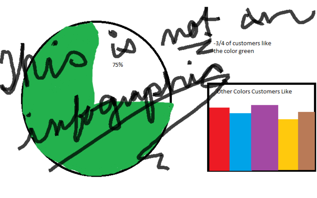
Before you dismiss infographics outright, make sure you’re doing it for the right reasons. A good infographic is one that tells a story in a visually appealing way and adds value to your content strategy. A bad infographic is just a collection of pie charts and graphs with some random words that don’t really make a point. It’s important to know the difference.
Take, for example, an infographic we recently did about the Mayweather/Pacquaio fight. It was a simple case study of pay-per-view boxing that related to a current sporting event. Not only did this infographic get significant social shares, it was also featured on USA Today and Sports Illustrated, and Mike Tyson shared it on his webpage and social media.
A properly executed infographic can get your message in front of a wider audience. If it has a valuable message, not only will people want to share it on social media, but major media organizations might want to share it, too. Both drive traffic to your website. When you provide people with something of value, they equate those good feelings with your brand, and those page clicks can turn into sales.

