DataViz = pretty charts, Infographics = pretty pictures
There are a lot of different ways to present visual information on the internet. DataViz takes information people want and presents it in a way that is easy to understand at a glance. Infographics is a cross between DataViz, journalism, and marketing. Infographics use multiple data visualizations and strategically chosen words to tell a complex story in a simple, visual way. You may think they are the same thing, but the terms cannot be used interchangeably.
What is DataViz anyway?
DataViz represents a single idea or statistic set, such as how many STEM graduates there are by country, as seen recently in Forbes. This is a great DataViz, but unfortunately it is mislabeled as an infographic. It’s a good example of DataViz, in that it takes an important data set and presents it in such a way you can easily make sense of it at a glance. But there’s no narrative or any indication of how this information relates to a larger point, such as a shortage of STEM workers and how it affects the global economy, which means it’s not an infographic.
Why do DataViz and Infographics get mixed up?
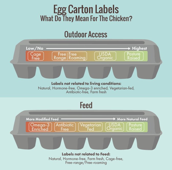
Sometimes when Dataviz is mislabeled as an infographic, though, it’s actually part of an infographic that has been cut up into smaller sections for whatever reason, and the label gets lost in translation. Here’s an informative DataViz about egg carton label meanings on HuffPo that is mislabeled as an infographic:
It is, however, actually part of a useful infographic all about eggs and egg production. It uses multiple DataViz and some strategic words and phrases to break down a concept that is actually a lot more complicated than most people realize:
Who’s Leading The Way In DataViz?
Alberto Cairo, a professor at the University of Miami, is a leading authority on the subject of DataViz. His book, The Functional Art, is considered to be an authoritative work on the subject. Not only is Cairo an authority on the subject, he’s also teaching the next generation of data journalists.
Who’s Leading The Way In Infographics?
Well, that would be us. We’ve been around for a decade, and we know how to turn a not-so-interesting subject like paint into a widely successful infographic:
Why is it so important?
It’s important to categorize DataViz and Infographics properly, especially in light of the near constant assertion that “infographics are dead.” DataViz and Infographics both have important roles in the ever-quickening pace of today’s internet-driven lifestyle, and it’s important to use the correct visualization for your purpose. If you need a DataViz, use a DataViz. If you need an Infographic, give us a call. Just make sure you use the correct term so you can get the right graphic for your needs.
Header Photo Courtesy of National Library of Ireland, DataViz courtesy of Forbes, Egg DataViz and Infographic courtesy of Fix.com.


