Using graphics to help display information is not a new concept, it has been around for centuries. These days, however, it is becoming a strategic marketing tool and art form all its own. People have different views of infographics, they are picky about them just as they would be a painting. Some graphics have almost no text whatsoever, leaving the entire concept it is trying to get across up to the viewer to understand. Other infographics use imagery to help relay statistics and to entertain the viewer.
To follow last years best infographics of 2010, we have put together a few of our favorites from 2011.
Update: we now offer social media infographics to the public.
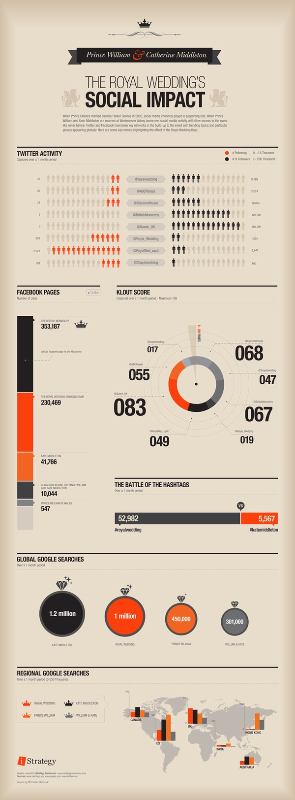
1. | The Royal Wedding’s Social Impact
2. | Tech Germs
3. | What Does it Take to Get a Job at Google?
4. | Twacked: When Good Twitter Accounts Go Bad
5. | Inside 5 of America’s Largest Data Centers
6. | Global Internet Traffic
7. | Facebook vs. Google
8. | The Top 20 Most Expensive Keywords
9. | Top Online Scams
![Top Online Scams [Infographic]](https://www.bbb.org/blog/wp-content/uploads/2011/07/top-online-scams.png)
10. | The Tale of the New Year’s Fail
courtesy of Nexercise.com


![Where Does Google Make Its Money? [ infographic ]](https://www.wordstream.com/images/where-does-google-make-its-money.png)
![The Tale of the New Year's Fail [Infographic]](https://www.nexercise.com//wp-content/uploads/2011/12/new-years-fail.png)
I’d really like a copy of poster no 9 (Top 10 Scams from BBB) – it’s so useful for new internet users to show them what they need to be alert to. Can I get a printed or electronic copy from somewhere? I’m in the UK.
Hey Clare – you can get it from the BBB
https://www.bbb.org/top-online-scams/
Very cool
artwork. I do some digital artwork myself.