Nobody has time to read anymore, right? Every day we are all inundated with more and more information overload coming from credible and yet to be verified sources. Where can Internet users find relief? Answer: the infographic. Infographics are a wonderful mix of key data and visualization that can really bring the message home if put together correctly. So without further ado, we bring you our top 10 favorite social media infographics!
Update: Check out our infographic design services
1 – World Map of Social Networks
Let’s start at the 50,000 foot view, shall we?

(Source)
2 – Age Distribution on Social Network Sites
Is age distribution targeting more your thing? Pingdom put together an excellent overview by social network:

(Source)
3 – Social Media Periodic Table of Elements
As we previously reported, our friend and fellow Advertising Age Power 150 member Eyecube created another great visualization called the social media periodic table of elements:
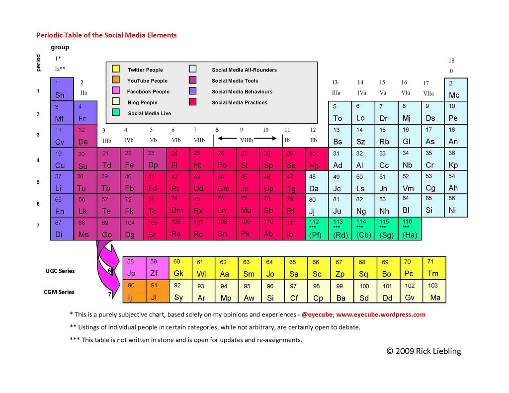
(Source)
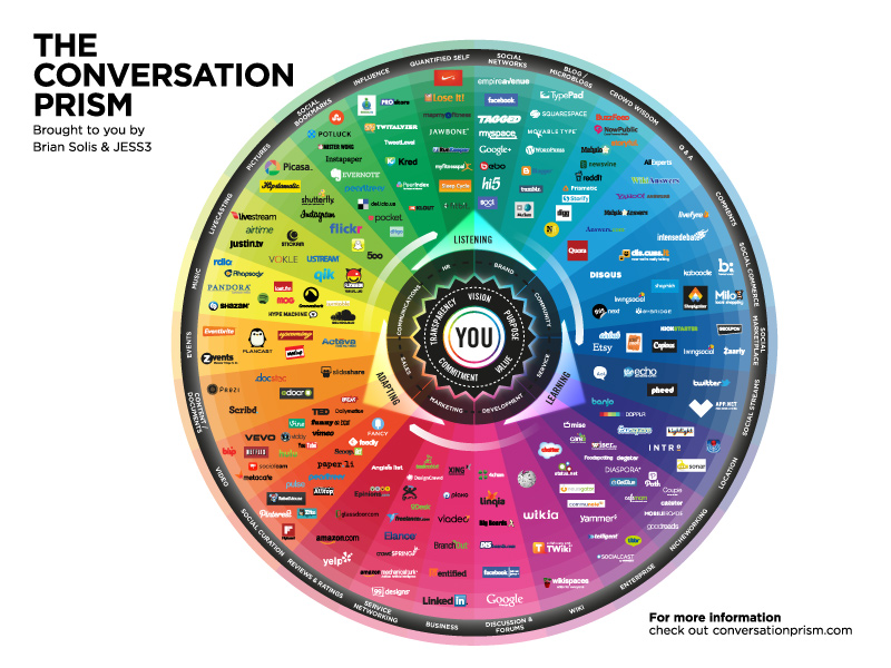
4 – The Conversation Prism
No social media infographic collection would be complete without Brian Solis’ Conversation Prism:
5 – The Boom of Social Sites
Focus.com put together an outstanding visual showing both the size and timeline of social communities:

(Source)
6 – Make Social Media Work For Your Company

(Source)
7 – Hubspot Twitter Territory
Hubspot of Twitter Grader fame nailed it with a slick infographic showing how each state’s Twitter usage compares to the national average:

(Source)
8 – How Twitter Got Attacked by DDOS
If you’re a frequent Twitter user, you’ll remember the great DDOS attack as a period of social media withdrawal:

(Source)
9 – Air Force Web Posting Response Assessment V.2
While we’re on the subject of Internet security, we’d be remiss to not mention the US Air Force’s blogging assessment flowchart infographic:

(Source)
10 -Visualizing 6 Years of Facebook
We thought that the best way to round out this list would be to celebrate Facebook’s recent 6th anniversary – Muhammad Saleem put together this excellent infographic over at Mashable:

(Source)
Interesting. I particularly liked Social Media Periodic Table of Elements and Visualizing 6 Years of Facebook
really very very informative and excellent article. specially the way of graphical represent ion.
I knew almost all of them but the ones with the DDOS and the Response Assessments are pure diamonds 🙂 10x for the curation!
It’s a great case study of Social Media as well as good visualization of records in graphic form.
Great collection. I am addicted to Facebook. I believe Twitter got huge popularity in very short time.
Can you please link to the images so we can enlarge and get a better view of them?
https://www.cmo.com/sites/default/files/CMO-SOCIAL-LANDSCAPE-R5.jpg you should add this one as well !
@Julius: yes both of those are among my favorites (hence in the list) 🙂
@Martin: DDOS and Response Assessments seem to be left out when people are thinking in terms of social media and infographics. Many I’ve come across are more about categorizing social networks, how-to’s, and their function, but I agree that anything cybersecurity related deserves inforgraphics of their own. Glad you liked the list!
@Donna: agreed – social media has come a long way, and we have the pics to prove it! 🙂
@Jasson: everyone is addicted to Facebook – most just don’t admit it yet. Numbers don’t lie – when Facebook overtakes Google in terms of traffic, that is powerful stuff.
@jerry: if you right click and view image you’ll be all set!
marketing de recherche (please use your name in the future, you’re getting a link anyway) – that’s a great one too, thanks for pointing it out!
Very nice collection. We have used a couple of these in our webinars. Personally I like #2 – Age Distribution on Social Network Sites the best. Just a real clean look at the demographics.
@Arnie – thanks for stopping in and RT’ing as well. I really like the Age Distribution as well – just a very well done balance of text and graphics that doesn’t lose the audience in its application.
The fifth graph about The Boom of Social Sites is particularly interesting.
Note that Qzone (the Chinese equivalent for Facebook) has 200,000,000 members, that’s 66% of all Facebook users and that’s five times as many peolpe as Twitter… Wow
Wow the numbers for Facebook are truely staggering, average user spends >55 minutes a day on it, and it has 400 million users. Impressive to think what could be achieved if people spent those 55 minutes a day doing something else for a week, perhaps volunteering.
Great post anyway, love the different interpretations!
@Benji: I enjoyed that one too, it was good to see the social sites not only by date created but also to view them in their relative size.
@Darryl: you raise a good point. Maybe you should make a Facebook page about volunteering for 55 minutes!
People who are talented in the domain of infographics can provide a great service to business. Would you use more infographics to promote, or convince in your business if you had a good infographics resource?
excellent collection
Nice information about Social Media, with Graphics. Like your way of showing information about Social Media…
Thanks
Its very informative. Show it in a Graphical view, really a good work.. but I can’t get the DDOS attack. I had never heard about it before. Thanks for your effort
Awesome visuals there! Like the Periodic table very much, being a Chem major and all — gives that dull table a whole new perception. 🙂
Me han gustado mucho, llega muy bien . Gracias
nice explanation in graphics mode and it help me a lot to build my social strategy
Very very insightful and innovative. More grace to you. These analyses have great potential in socio-political decision-makings.
hello,
SEO Themelis Cuiper here
from Amsterdam The Netherlands.
The combination of 4 – 6 – 9 teaches a lot on how to go about advising a company
Doing solely socialmedia as a consultant like a 1 man band is asking for failure,
Yes you have to take the lionshare in the beginning teaching the company members
on how to do socialmedia but you have to let loose trusting they know their own core business and the purpose of socialmedia on the job.
Great graphics like these explain big concepts in a short time to people.
I would like to compliment you with this post Brian !
SEO Themelis Cuiper
Social Media – market analyst
I particularly was enthusiastic that I got a proof of what I had thought before: MySpace is loved by the kids, young adults love their Facebooks and the martured use LinkedIn which is one of the reasons why it is so …. slow sometimes. And that language capabiliy next to cultural barrieres is one of the main reasons why social networks such as Facebook work for the western world well, but e.g. not within China. But what the hell is going on in the Netherlands and Poland?!?
That’s really funny… I started a content seeding blog for our company/clients and with those posts. If you are looking for more infographic/ visualizations around media I try to keep on top of this stuff.
No commentary just infographics/ slide-shares and videos around social media . Its like a targeted version of cool infographics.
Nice collection of social media information. I really like the timeline of the various popular social networking sites over time. MySpace and Facebook are huge!
Always good to see that infographics are getting more and more attention, as a way to show information.
I leave here an invitation for all of you to visit Visual Loop (https://visualoop.tumblr.com/), where you’ll find hundreds of infographics and other visualization goodies.
On this specific mather, Social Media, we have over 50!!! (https://visualoop.tumblr.com/search/Social+media).
Keep up the great work!
@TSSVeloso
Nice work and a good post indeed. I love the color wheel. Ill retweet it
Thanks for sharing this info.
Here’s my take on what businesses should aim for when using social media:
https://byrnesconsulting.com/2010/04/08/what-to-aim-for-when-using-social-media/
Mike Byrnes, President, Byrnes Consulting, LLC
@Michael Rogosin:
I believe that good infographics are a great way of promotion as they usually generate a good amount of traffic, links, and inbounds. Still, they can be time consuming and there are limitations if you want to keep up good quality.
@Kisor: the DDOS one really stood out to me – tried to put together a good mix of both popular and not as yet well-known infographics.
@Doria: I’m sure a social media periodic table of elements must be uniquely interesting for a Chem major! 🙂
@Bilal Ahmed: Glad to hear that it helped your own strategy.
@Markus Bussmann: it’s interesting to see both the age demographic and country specific implications of social media. we did a post several weeks back discussing international social media that you might enjoy here.
@Mike Handy: thanks – I may have to take you up on that for a follow up social media infographic post.
@TSSVeloso: thank you for linking to your tumblr – great resource!
@mia: glad you liked the color wheel, and thank you for retweeting
@Mike Byrnes: thanks for linking, good to see your point of view.
This is a really cool piece – thank you so much for exposing it to us all. I am RTing it to my network
Regards
Matt
@Matthew: glad you enjoyed and thank you for retweeting!
Very interesting charts. There are so many network sites I haven’t even heard about yet they have millions of members. It would be interesting to learn how exactly these sites have become so popular.
thanks a lot for those list of infographics. It’s always nice to keep track of all those statistics. cheers, jonny
That’s realy perfect article.
Thanks.
Thanks a lot for those infographics! I hate reading 🙂 Has been shared to my networks.
Infographics sure are a very effective means to communicate and comprehensible, especially when you are dealing with “new” concepts. People think and remember in pictures, not in words, and giving them an infographic is a sure fire way of getting your message across.
The challenge with infographics are that you need to know that the search engine spiders can not “see” the graphic, because they “read” information. Proper page titles, meta descriptions, some descriptive content around the inforgraphic, along with a descriptive alt tag is what is needed to give the search engine bots the information they require to catalogue your infographic.
thanks so much for this post. would have loved some click to enlarge diagrams. but a great post nonetheless.
Interesting.. I’m a big fan of facebook and twitter too.
Thank you nice diagrams that show it all
Thank you for this list of computer graphics on social media !
Excellent diagram thanks for sharing.
Copy all of the above, thanks!
I think you absolutely right about nobady having time to read anymore! We all are too busy using social media right now…! 🙂
What a collection of truly fascinating infographics! I especially like the one from Mashable about the explosion of growth at FaceBook. It is really staggering to think about how rapidly the site has taken hold of such a large part of the social media landscape. Though on the other hand was there a social media landscape prior to FaceBook?
Great set of diagrams, my favourite is #5 as it’s quite surprising just how many really large players there are, yet how few get mentioned day by day.
Amazing approach to this entire field. I quite enjoyed the article here.
Nice collection of social media information. I really like the timeline of the various popular social networking sites over time. MySpace and Facebook are huge!
Definitely great stuff to keep in memory really face things are written here thanks for sharing cheers!!! :O
#5 is an interesting one, I had no idea that there was that many social media sites. Also, surprising how close MySpace and Facebook were!
Dont know how I came across this blog but its fantastic
Dont know how I came across this blog but its fantastic
Interesting infographics.. I’m a big fan of Facebook and Twitter as well.
Hi Brian, This is a really creative way of showing the strengths of the various Social Media Networks and the relationships between them.
Thanks for sharing – I have RT’d the link!
Great graphics but as everyone should know by now, age statistics for websites are very inaccurate. While Facebook might be up there closer to the truth because they really go for the real you, there are countless people who make accounts to appear older or even younger on the Internet to appeal to a different group. Not to mention the countless people who register multiple accounts for various reasons on sites which skews the statistics even more. On top of that, most of these companies would not reveal this data, especially to a rival like Google where the age demographic is listing as its source, compiled by pingdom, an up-time monitoring service, which has nothing to do with the data listed.
Interesting Info-graphics. I enjoyed reading this. Hats off to you.
But i missed one “4 – The Conversation Prism”. I don’t know what happened but the Image is not loading.
Another note is ports won’t admit non-operable vehicle for roll-on roll-off transport service.
The popular NCIS spin-off television series returns
in NCIS: Los Angeles: The Complete Fourth Season. In order to be sure you might be
getting the most effective deals be sure to read all of
the terms and conditions for the site.