Love them or hate them, infographics are an incredible way of displaying large amounts of data, giving the viewer a wonderful mnemonic device in being able to recall data.
Last time, I had led you through a collection of my top 10 favorite social media infographics. They were meant to convey a story – each in their own way as well as the set in its entirety.
This time, I’ll be leading you through a more industry specific approach in infographics – technology.
1 – The History of Location Technology
Mashable serves up an interesting historical perspective on the origins of location based technologies. Smoke signals, anyone ? 😉

(source)
2 – State of the Internet
Focus.com has a wonderful visual of the state of the Internet. Wonderful colorful slices of age/gender/and country demographics.
(source)
3 – What People are Doing Online
It is interesting to not only break down online users by age demographic – clustering by Internet usage is fascinating when you see how it plays out by age:

(source)
4 – The Cost of Technology
Interesting look at how today’s toys size up against gadgets of yesteryear:

(credit)
5 – The Rise of Netbooks
GigaOM reports on the rise of netbooks from 2008-2010. This is an important advent in tech history, as it allows the user to have a semi-powerful machine built to access cloud computing:

(source)
6 – What is Cloud Computing?
If you were wondering what cloud computing was from the last infographic’s reference, Wikibon does a good job laying out the basics of Cloud Computing and Software as a Service (SaaS):
7 – The History of the Rickroll
No advancement of technology list would be complete without it 😉
8 – Online Gaming Stats
One of the best things about the Internet these days is the explosive growth of depth and complexity of online gaming:

(credit)
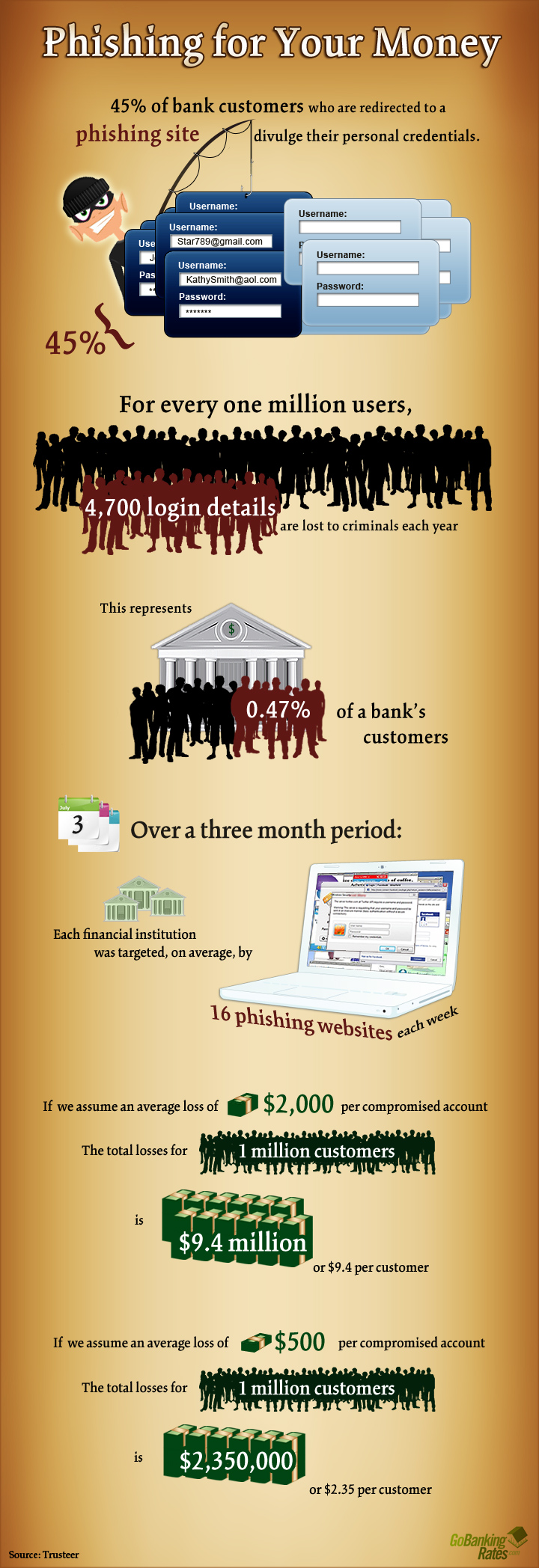
9 – Phishing for Your Money
Unfortunately, the Internet isn’t just fun and games. Lots of phishing attempts are out to get into to your bank account:

(credit)
10 – What is HTML5?
With all the news about the Apple iPad not supporting flash in favor of HTML5, I thought it would be useful to end this infographic list with some demystifying of what HTML5 actually is:

(credit)


my vote for love ’em; infographics are the next best thing since the condom.
This is a lot of interesting data that provides insight on how our society operates today and in the past. I think we can learn a lot from what has happened in the past and operate more effectively as a society as a whole.
I am surprised how with all this data about data, the facts about how much energy is being used to power games, phones, movies, etc. was not even addressed.
How much energy was used to distribute all the Rick Astley pranks? Was that a good use of fossil fuels? I hope there is a cap on Rick Rolling by now.
I’d like to see infographics on the energy used at the home and data center levels.
They are all wonderful information sources. I am really excited to look at each of those stats. I love this technology because of their capability of presenting complex information with nice and neat graphics. I think the governments uses them more with many more information representation formats, say a video enabled!
Infographics come alive 🙂
This is a lot of interesting data that provides insight on how our society operates today and in the past.
Hi Brian Wallace,thanks for the awesome post.Well said! infographics is here to stay.it is amazing how large chunks of data can be represented using pictures.If you have written the above illustrated data,I bet even half of the current readers would have read this post completely.Pictures definitely do speak louder than words!
These infographics are quite intriguing. They have such a unique way of presenting information–I really like the setup.
Thanks!
Loove it Brian. Here’s another good one https://visual.ly/how-online-credit-card-processing-really-works-9-steps